In September, Seattle University students Perry Firth and Krista Kent created nine new infographics as part of our series, Poverty and Homelessness in the Public School System. The experience inspired them to create one super-infographic that they nicknamed “The Big Brain.” It took them three months. What are the perils of encapsulating so much information into one bold visualization? Perry takes us behind the scenes of creating this brand-new infographic, “Child Homelessness & Toxic Stress: Far-Reaching Consequences,” and shares some pointers for designers and writers who take on the challenges of conveying complex data.
Written by Perry Firth, project coordinator, Seattle University’s Project on Family Homelessness and school psychology graduate student
I once read somewhere that we have the attention span of goldfish.
Or, at least I think that’s what I read. I was scanning the article, so I could be wrong.
Jokes aside, there is no doubt that the Internet is shaping how information is conveyed, and interacted with. People are reading less. Yes, it’s true. And, in our Internet-saturated culture, our attention spans are also decreasing.
We start articles, but we don’t always finish them.
Where once people were more interested in in-depth analysis of a particular subject matter, now we scan content quickly, picking out choice pieces of information.

This is something that the Project on Family Homelessness team is aware of. Therefore we have increasingly prioritized developing high-quality infographics (visual representations of information) – either on behalf of our partner organizations or for our own content – as a way to convey our messaging without overwhelming our audience.
And no, the irony is not lost on me that I am writing something that requires reading, about how people aren’t reading. Ha!
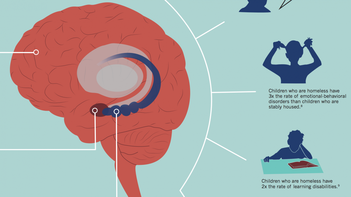
“THE BIG BRAIN”: Sharing Information About Children and Homelessness
Much of what we write about on our project is inherently complex and overlapping (e.g., homelessness, toxic stress, exposure to violence, academic achievement). Especially when I am the one writing, this can lead to long, complex pieces.
Our Firesteel editor seems to like this because readers can really learn something from all that information. But at the same time, readers spend less time with individual articles, and have turned into goldfinches (or was it goldfishes?). Thus, we need to explore other ways of conveying our messaging.

Therefore, I relish the opportunity to translate important information into a visual medium. However, the same issue of “what to include/what to leave out” that I face when writing is even more of a challenge in designing a comprehensive infographic.
This is something we learned when we made the decision to create an infographic that pulled together various concepts from a seven-part blog series I wrote this summer for Firesteel, Poverty and Homelessness in the Public Education System.
The series itself is an in-depth exploration of the many different variables that hinder a child’s ability to succeed in school. I wrote it to provide an overarching illustration of the world that very poor children inhabit. I wanted it to be comprehensive and thorough.
What made this series extra cool is that we designed an infographic for each part of the series. Even cooler, these infographics got a lot of attention.
From being shared widely on social media, to being quoted on the Philadelphia Inquirer news site, it was clear that the infographics were popular.
Therefore, we decided to design one “super-infographic” that pulled together key information on the different variables and outcomes that can accompany childhood homelessness. We nicknamed it “The Big Brain.”
TRANSLATING COMPLEX DATA
However, when we were trying to translate key points into a comprehensive infographic, we faced an uphill battle. Questions included:
- What are the most important things for readers to understand about how toxic stress changes the brain? How do we illustrate this?
- What academic data and key facts most powerfully illustrate how homelessness hurts children?
- Should we include information on how significant adversity in childhood (ACEs) can lead to adult homelessness?
- How big is too big?
These questions, of course, lead to questions of design and space.
OUR DESIGN AND CONTENT DECISIONS
Thankfully, we had Krista Kent, our talented digital designer, to guide our design enthusiasms. Krista was finishing up her bachelor’s degree in digital design at Seattle University, and this was like a capstone project for her.
Some of our decisions:
- Because of the massive amount of material we were considering, we decided to make the infographic quite large.
- We also experimented with the dimensions of the piece, laying information out horizontally and vertically.
- We also managed to whittle down the written content as we progressed through different iterations.
Ultimately we decided that this infographic would touch on the following key areas:
- How chronic stress and homelessness impact the developing brain.
- Key facts about the different challenges faced by homeless students, caused by toxic stress.
- Prevalence of student homelessness nationally and in Washington state.
- Academic achievement data of students experiencing homelessness, and how this differs from housed peers.
- The number of children experiencing different levels of adversity in the typical high school classroom.
- And, how increasing levels of adversity in childhood is related to adult homelessness.
Our goal was for readers with little time – and maybe even less knowledge of childhood homelessness – to come away with an overview of how it impacts children.
I hope we achieved this goal. In particular, the toxic stress angle is a relatively novel take on childhood homelessness.
The culmination of months of back and forth, this infographic is a “one-stop shop” on toxic stress, homelessness, long-term outcomes, child development, and childhood homelessness prevalence for our audience.
EIGHT THINGS I LEARNED
- Designing a good infographic takes a long time. Don’t rush it. Creating nine infographics for the original Firesteel series in two weeks was way too fast, which is one of the reasons we took our time on the “Big Brain.”
- Experiment with different design variations until you have achieved something workable. This may take longer than expected. For example, we initially had the brain at the bottom of the infographic, but we realized moving it to the top put the focus where it belonged. We also originally had the facts attached to the brain standing on their own; but by connecting them visually to the brain, we showed the physiological connections as well.
- Make sure you get feedback from people as you go. You might find out that you’ve been sacrificing clarity for brevity.
- Be able to let go of some content. Just like writing, making content decisions isn’t easy. You have to be a little ruthless around what gets to stay or go. For example, I realized that I was going to have to cut out some of the information on brain processes.
- Shorten your citations and link to them. If you have a lot of references (which we did for this infographic), it takes a lot of room to fit them all onto the infographic in correct APA format. Therefore, we decided to use a link shortener, so people could be taken to back to the original source.
- Do the “headache test.” A great way to decide if there is too much information on your standard-size infographic is to do what I call the headache test. Does looking at your infographic give you a headache? If so, you need to upgrade it to a larger size so that things fit better, or you need to cut stuff out. In our case, we decided to upgrade to a larger size.
- Write before you design. I actually wrote a lot of the content before we started the design process. I think this is a good way to do it, because then the content can provide inspiration for design choices. Krista refers to this as solving “the puzzle of visual communication.”
- Proofread – a lot. There seems to be something uniquely challenging about finding typos in infographics. Don’t let your attention to the visuals detract from making sure the copy is perfect.
So take a minute and check out our latest infographic, the aptly titled “Big Brain!” It is spec’d for a 24” by 36” poster size (though it works as 8-1/2” by 11,” just small and harder to read). It would work great printed out and put up in an office, or at an event. I could see it being a helpful tool in a school (maybe in the teacher’s lounge?) as well.
Also, watch for another infographic that we developed with Columbia Legal Services, “Who Are Washington’s Homeless Children and Youth?”
LEARN MORE
- Check out this infographic our team developed last year with the Housing Development Consortium of Seattle-King County, “Is There Enough Affordable Housing in Seattle?” HDC explained a lot of complex data and terminology very simply. Even simple numbers can be more powerful when expressed visually; we still love the school bus with the license plate that shows the number of children who are homeless, and we repeated that in the Big Brain. This infographic still gets used a lot, including by the Seattle Times. HDC even made different versions for the Eastside and South King County.
- Spend some time looking at the infographics and charts on the Institute for Children, Poverty and Homelessness They do a great job of clearly communicating important data.
- Check out Visual.ly’s “The Top 20 Infographics of 2013.” What do they have in common? What makes them interesting?
What’s the best housing or advocacy-related infographic you saw this year? Let us know by leaving a comment below!
Pingback: Picturing Child Homelessness: The Challenges Behind “The Big Brain” | Seattle University Project on Family Homelessness()
Pingback: New Infographics on Childhood Homelessness, Education, and Child Development | Seattle University Project on Family Homelessness()